Using data to improve the locations screen on Lunchbox apps
Using data to improve the locations screen on Lunchbox apps
Using data to improve the locations screen on Lunchbox apps
Using data to improve the locations screen on Lunchbox apps
In the Lunchbox app ecosystem, the locations screen is a crucial step in the customer journey of placing an order for pick-up or delivery. As the lead product designer, I led a cross-functional team effort to address usability issues and overhaul the legacy screens
In the Lunchbox app ecosystem, the locations screen is a crucial step in the customer journey of placing an order for pick-up or delivery. As the lead product designer, I led a cross-functional team effort to address usability issues and overhaul the legacy screens
In the Lunchbox app ecosystem, the locations screen is a crucial step in the customer journey of placing an order for pick-up or delivery. As the lead product designer, I led a cross-functional team effort to address usability issues and overhaul the legacy screens
Using data to improve the locations screen on Lunchbox apps
In the Lunchbox app ecosystem, the locations screen is a crucial step in the customer journey of placing an order for pick-up or delivery. As the lead product designer, I led a cross-functional team effort to address usability issues and overhaul the legacy screens
Objective
Address and solve for concerns around scalability issues for brand customization, drive easier ordering to get the customer to the menu faster, and address layout issues
Address and solve for concerns around scalability issues for brand customization, drive easier ordering to get the customer to the menu faster, and address layout issues
Problem
Customers and clients were raising the issue that the screen was cluttered and lacked clarity and for clients – it required too much back and forth with the Lunchbox CX team to get the layout right. Time spent tweaking = pushing the go-live date back and no sales
Customers and clients were raising the issue that the screen was cluttered and lacked clarity and for clients – it required too much back and forth with the Lunchbox CX team to get the layout right. Time spent tweaking = pushing the go-live date back and no sales
Time frame
Feb – Apr 2024
Feb – Apr 2024
Personnel
Product Manager
Engineering Team
Onboarding Team
Product Manager
Engineering Team
Onboarding Team
Objective
Address and solve for concerns around scalability issues for brand customization, drive easier ordering to get the customer to the menu faster, and address layout issues
Problem
Customers and clients were raising the issue that the screen was cluttered and lacked clarity and for clients – it required too much back and forth with the Lunchbox CX team to get the layout right. Time spent tweaking = pushing the go-live date back and no sales
Personnel
Product Manager
Engineering Team
Onboarding Team
Time Frame
Feb – Apr 2024
Bonus!
Bonus!
Bonus!
Bonus!
Bonus!
Bonus!
In early steps of this project, we identified an already scoped feature request from our backlog that we could tackle along with this: the ability to filter by location type when searching locations. A win-win!
In early steps of this project, we identified an already scoped feature request from our backlog that we could tackle along with this: the ability to filter by location type when searching locations. A win-win!
In early steps of this project, we identified an already scoped feature request from our backlog that we could tackle along with this: the ability to filter by location type when searching locations. A win-win!
Initial Discovery
Initial Discovery
Initial Discovery
Initial Discovery
Initial Discovery
Due to existing backend constraints, we decided as a team to not change the flow, but mainly focus on the information architecture and layout.
With my PM, we kicked things off with a Fullstory session and uncovered that only 3% of users clicked on the ‘View Hours’ button. We wondered why this was the case. Early questions in our internal debrief included:
Is the ‘View Hours’ option useful?
Should ‘View Hours’ be given the same emphasis as ‘Order Now’?
Can we drive quicker decision making by improving contrast and using buttons rather than text for CTAs?
How can we improve grouping, spacing, and hierarchy to make these cards more effective?
Initial Discovery
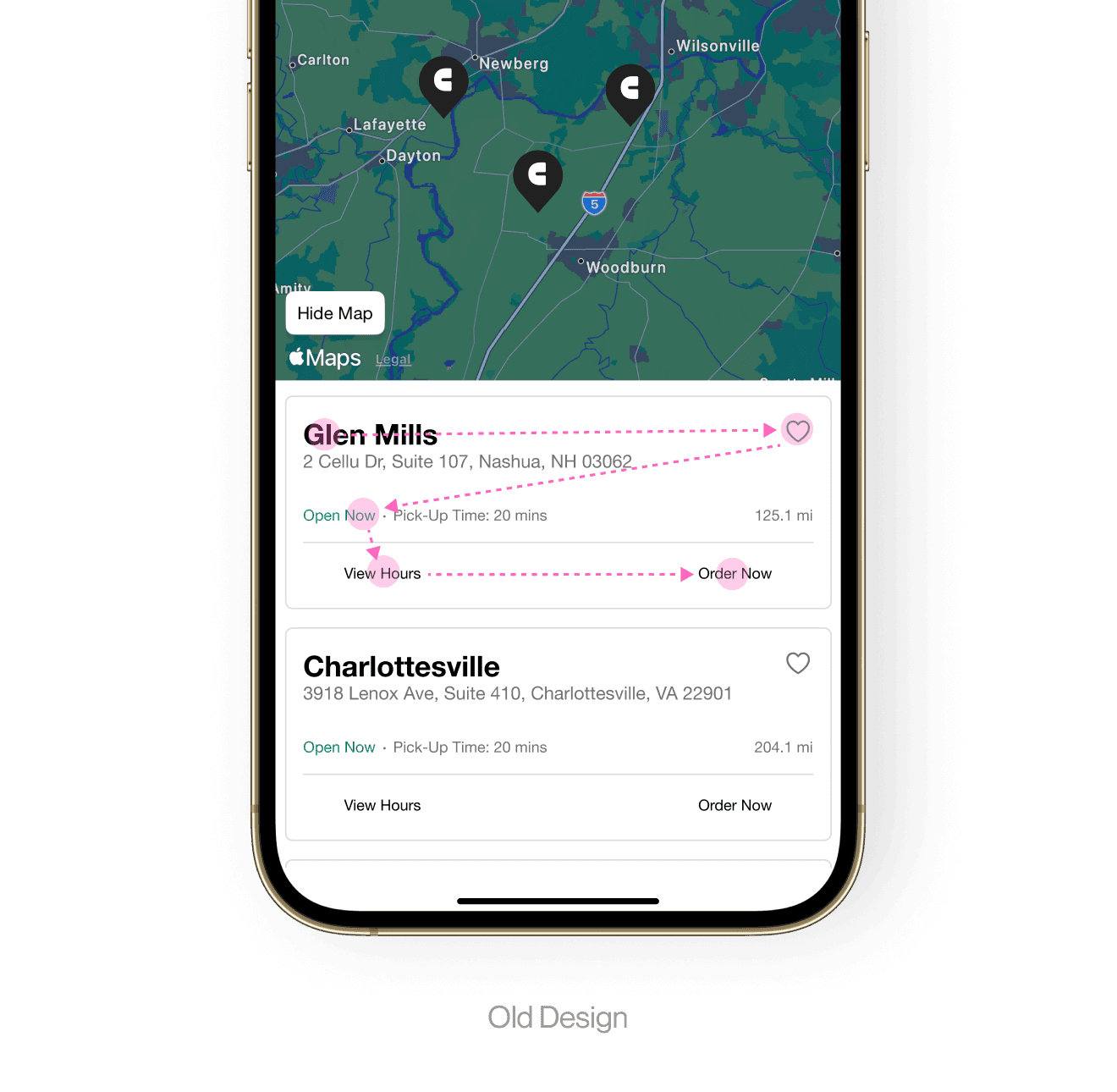
CUSTOMER QUOTE • OLD DESIGN
CUSTOMER QUOTE • OLD DESIGN
CUSTOMER QUOTE • OLD DESIGN
CUSTOMER QUOTE • OLD DESIGN
The text is so small here! And the layout feels confusing to me. Some things are cramped and others are pretty spaced out.
The text is so small here! And the layout feels confusing to me. Some things are cramped and others are pretty spaced out.
The text is so small here! And the layout feels confusing to me. Some things are cramped and others are pretty spaced out.
The text is so small here! And the layout feels confusing to me. Some things are cramped and others are pretty spaced out.
The text is so small here! And the layout feels confusing to me. Some things are cramped and others are pretty spaced out.
Customer Interviews
Customer Interviews
Customer Interviews
Customer Interviews
Customer Interviews
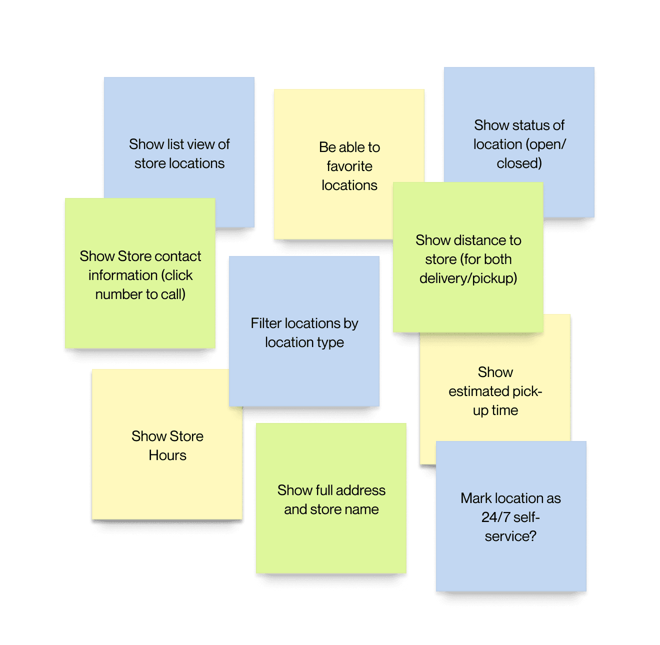
I conducted interviews with 3 of our restaurants brands as well as 3 internal SMEs to gather insights into aspects of the design causing frustration. Speaking with customers solidified our direction of the redesign as well as defined the MVP. Key takeaways were:
The current layout was an issue and didn’t feel professional. Spacing seemed to be all over the place often without rhyme or reason
Users reported not really caring to see store hours when they could see a location was open/closed (still good to have)
Type sizes were hard to see in some cases
The currently displayed information for locations was fine
The ability to be able to filter location types was wanted by most clients, but not all
Some brands wanted the ability to mark a location as a 24/7 self-service location
I conducted interviews with 3 of our restaurants brands as well as 3 internal SMEs to gather insights into aspects of the design causing frustration. Speaking with customers solidified our direction of the redesign as well as defined the MVP. Key takeaways were:
The layout was an issue and didn’t feel professional. Spacing seemed to be all over the place often without rhyme or reason
Users reported not really caring to see store hours when they could see a location was open/closed (still good to have)
Type sizes were hard to see in some cases
The currently displayed information for locations was fine
The ability to be able to filter location types was wanted by most clients, but not all
Some brands wanted the ability to mark a location as a 24/7 self-service location
Customer Interviews
Current Designs Audit
Current Designs Audit
Current Designs Audit
Current Designs Audit
Text size, grouping, use of white space, and padding issues lend to a cluttered user experience here. I immediately wanted to explore ditching a bucket card style and opt for text with line dividers to optimize real estate and improve legibility.
I began with a hypothesis that by reducing emphasis on ‘View Hours’ and increasing emphasis on ‘Order Now’, we could reduce time and friction in selecting a location to order from, with secondhand benefits including improving the visual design, hierarchy, and scannability of the page.
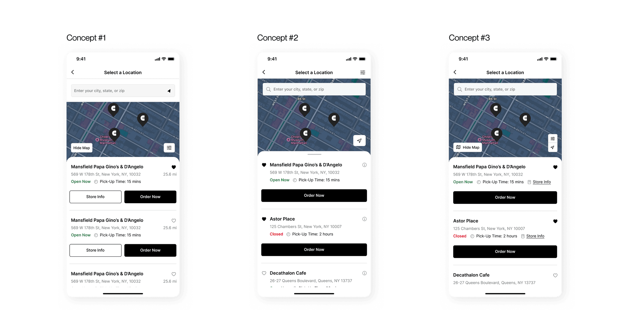
Ideation & Usability Tests
Ideation & Usability Tests
After a few rounds of wireframing and ideation, I conducted a round of user testing with prototypes to validate my designs. I tested three different sets of designs with differing layout approaches.
Concept #2 performed the best with participants rating its structure and the use of a draggable full screen modal as the preferred layout (eliminating the need for a 'hide map button'). Concepts #1 and #3 overall scored lower as they were a bit “busy” and had too many buttons and too many icons, respectively.
Some participants noted it would be nice to be able to view all their favorited locations at a glance. Based on all our feedback gathered, we moved forward with Concept #2 and implemented adjustments to improve the overall user experience.
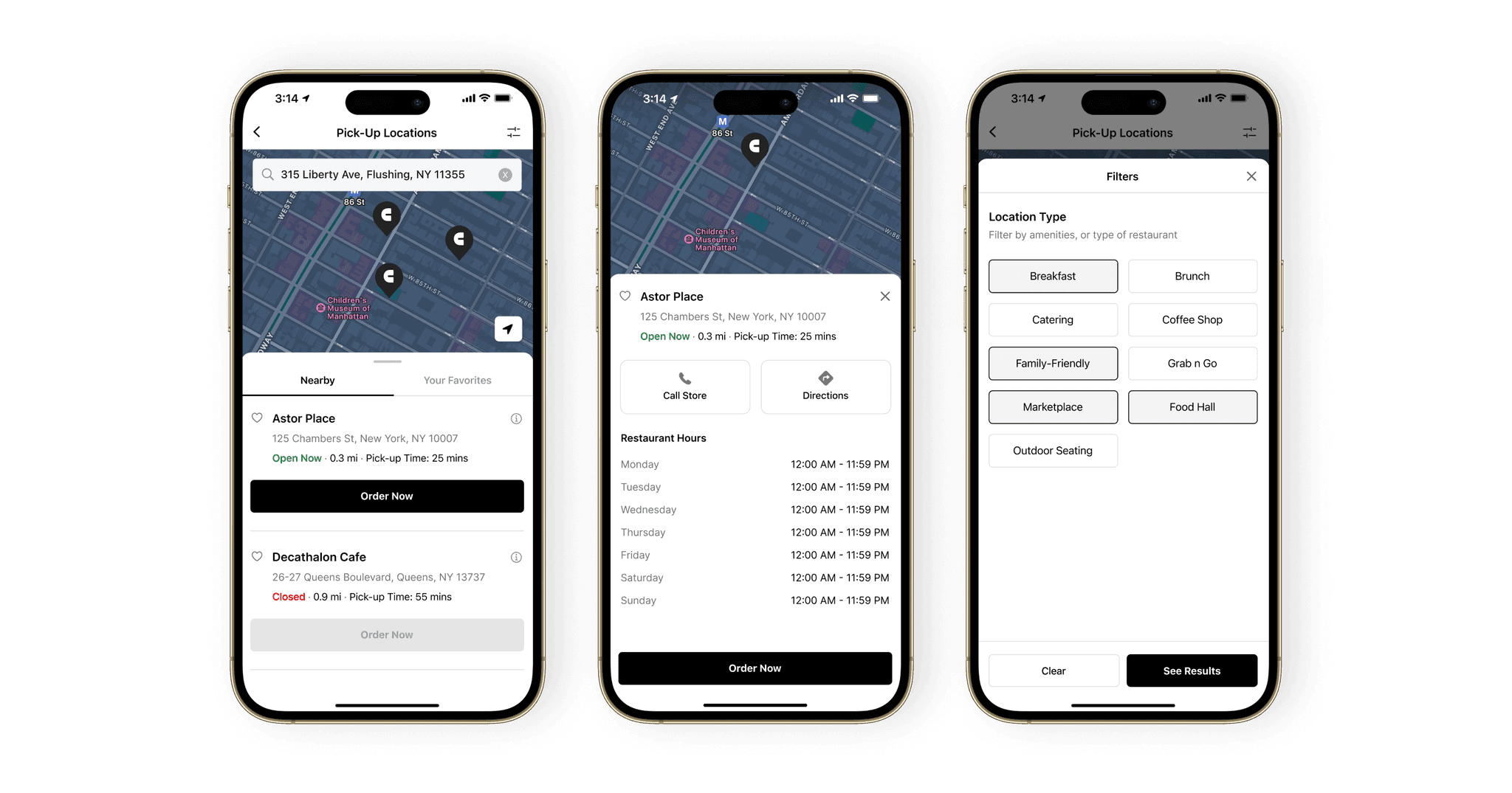
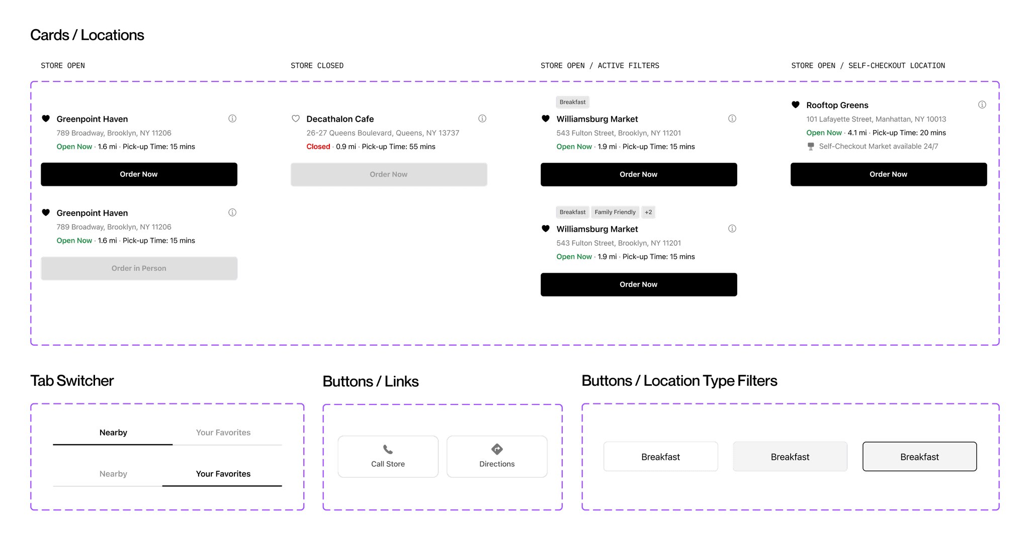
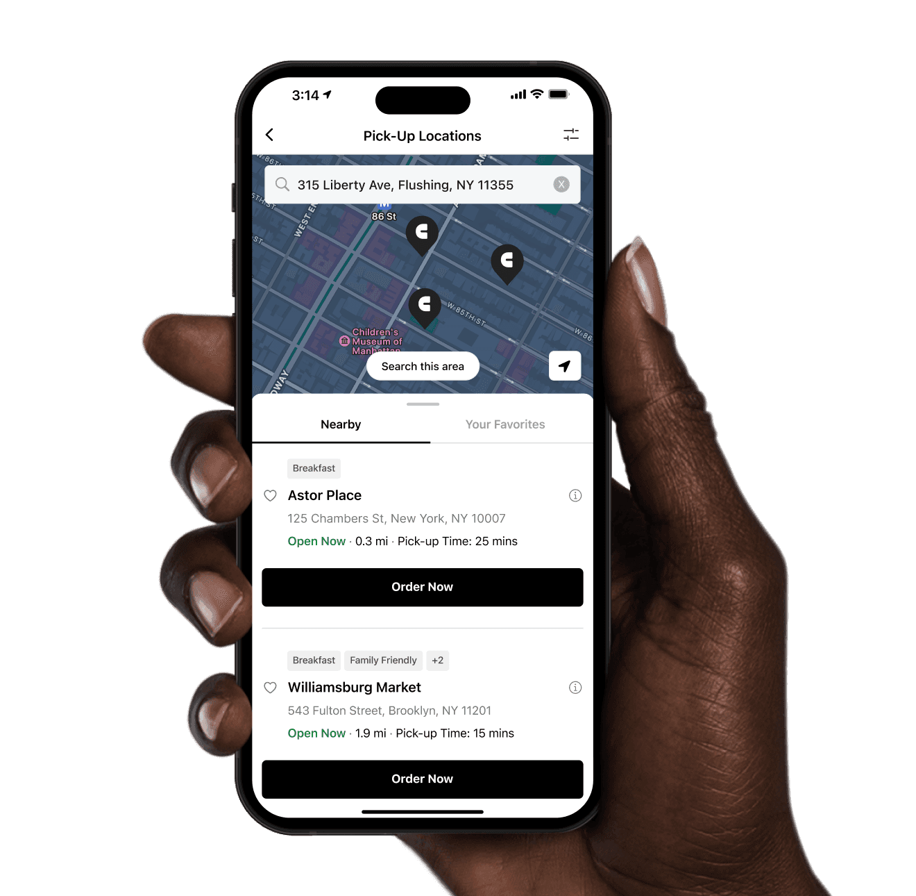
The Finished Product
The Finished Product
The new design delivered a cleaner and more focused appearance. Using data from Fullstory, I reduced ‘View Hours’ to an info icon, ‘Order Now’ was given full attention with a clear CTA button to drive customer ordering, and an easy-to-use location filter with large touch-zone buttons was added. A few other upgrades included:
Refined type scales, line heights, and padding to improve visual harmony and quick scanning
A tab was added to switch between favorited locations and nearby locations
Active filter badges were added for easy recognition for location types
The search field was integrated into the map container to increase map real estate on the screen
A simple 'use my location' icon to locate stores in the vicinity
The Finished Product
Takeaways
Takeaways
Takeaways
Takeaways
Takeaways
With an only 3% click rate on the old ‘View Hours’, we knew we could design a better experience that reflected what users needed the most – selecting a location quickly to order quickly!
Improved customer satisfaction – Increased overall reported customer satisfaction with the location selection process from 55% to 95%
Shorter time to order – Decrease in time spent selecting a location to order from. Users got to the menu quicker!
Improved guest experience – Customer surveys reported strong gains in ease of use, design professionalism, and consistency and hierarchy
Improved conversion metrics – Slight decrease in users abandoning the order process
Takeaways
The text is so small here! And the layout feels confusing to me. Some things are cramped and others are pretty spaced out.
CUSTOMER QUOTE • OLD DESIGN