I knew that to uncover solutions, I had to fully understand the problems the team was facing. I started by interviewing 3 key people on the Onboarding team, followed by 2 other internal SMEs. Some key takeaways included:
The Onboarding team had their go-to person for migration troubleshooting. Each week he was dropping what he was working on to spend several hours fixing file upload errors
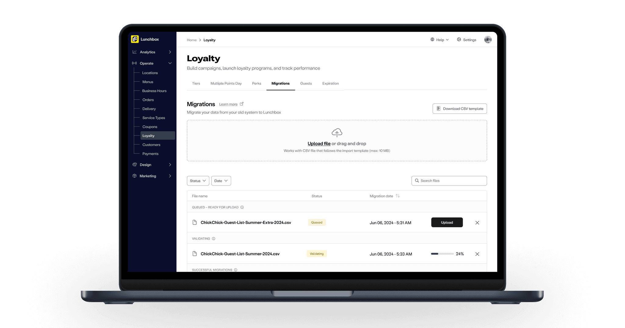
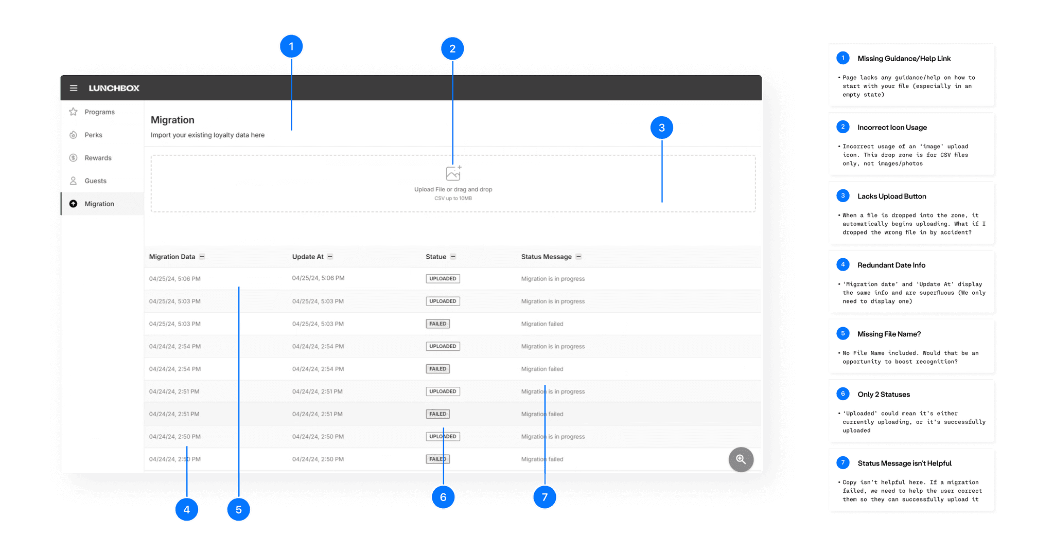
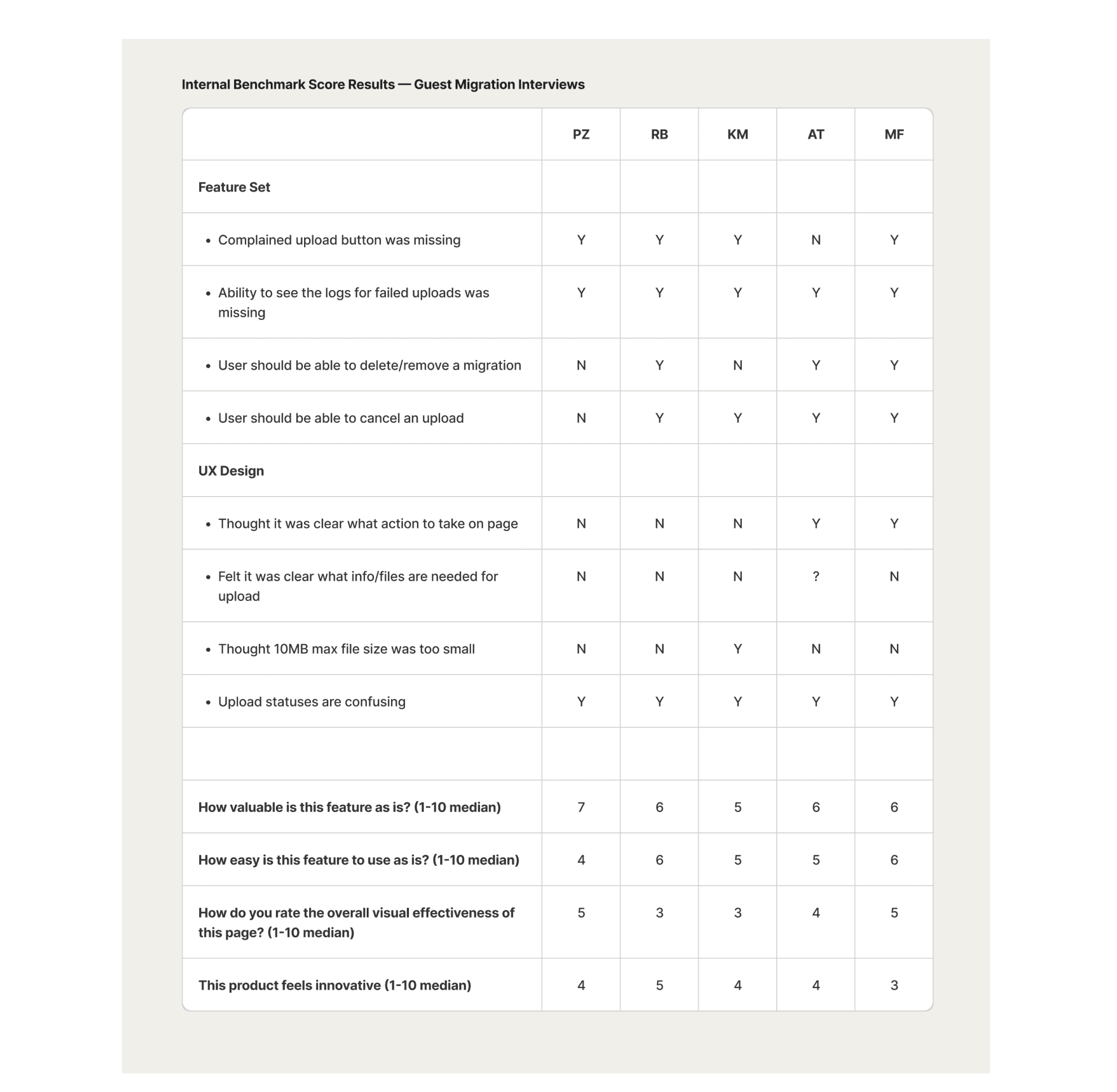
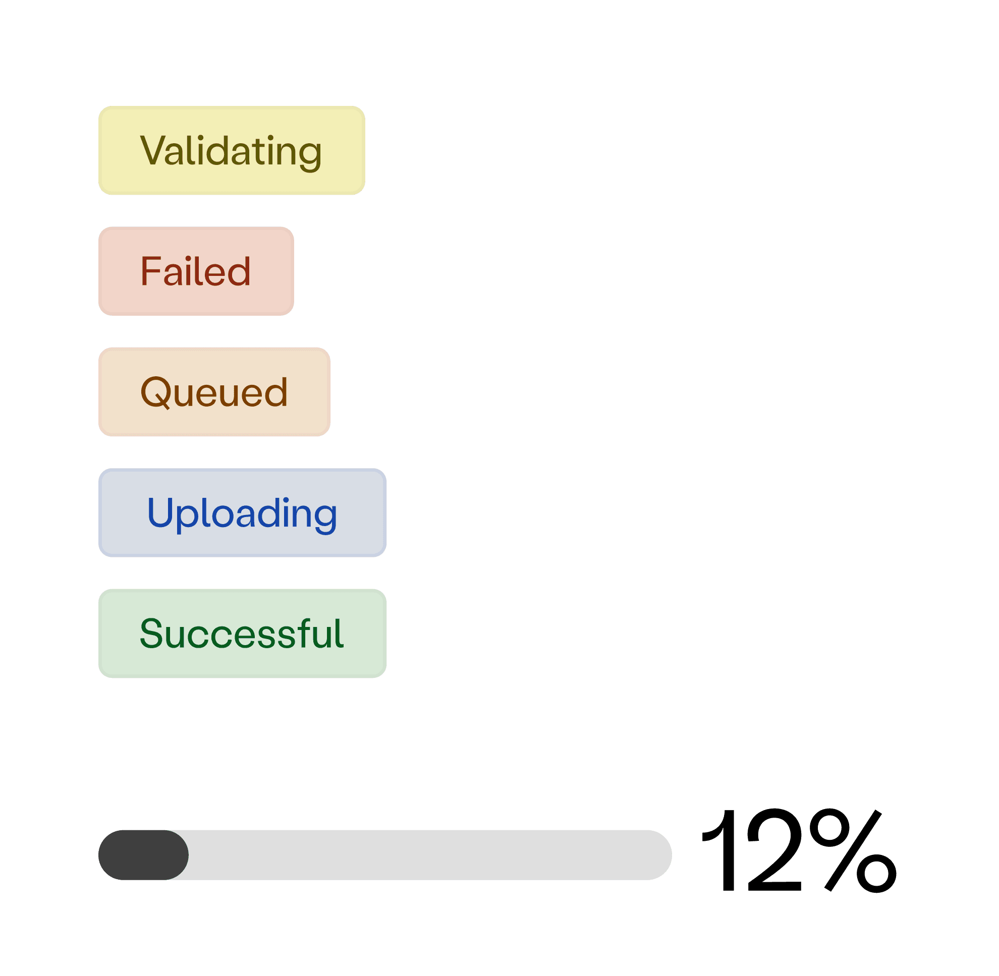
Uploading was confusing! There was only 2 file statuses (uploaded or failed). They couldn’t tell when a file was successfully uploaded
There was a general distrust of the new admin dashboard. How could I help bridge that gap and build trust for the team through design?
It’s not clear what’s needed from a file to begin uploading. This translates into Onboarding confusion, thus confusion for clients and increased errors
I had Onboarding walk me through the process of how they upload a migration file on the old dashboard. The entire process was recorded for team review and ingested via Dovetail.
I began with a hypothesis that by helping users understand what is needed for a file upload (and providing help for navigating upload errors), and by providing a cleaner interface that communicated upload status, we could reduce overall time spent by the Onboarding team carrying out migration uploads.
Before delving into ideation and exploring directions, I wanted to level-set some metrics to track over time. These results also helped us define what the MVP should deliver:
A general consensus of not being sure how a file should be formatted and what might cause an error in upload
Upload statuses (or lack thereof) were a major point of confusion
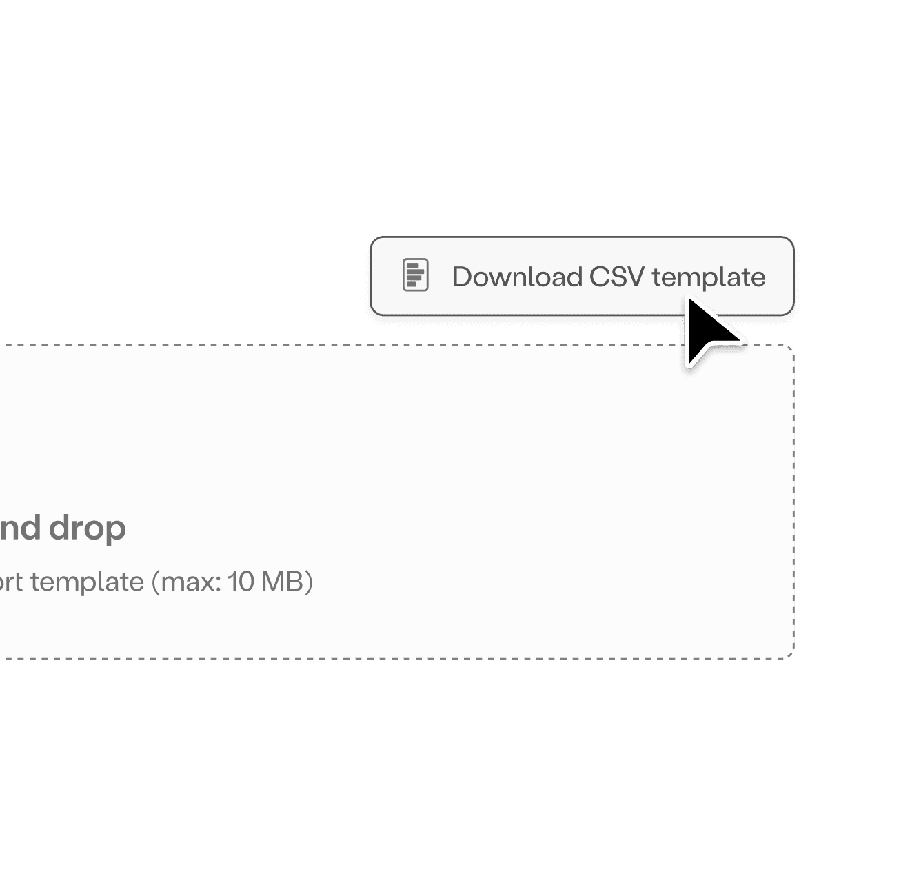
Users wanted to see an error log of what caused a file upload to fail
User sentiment around innovation of the current design clocked in at a mean score of 40%. A new goal emerged from this research as well – Besides driving adoption of the new dashboard, we had to help build Onboarding's trust in the platform.
Solution: The upload system needs to keep users updated on exactly what is happening.
We created new statuses to clearly label what stage a file was in to deliver a reliable and predictable experience, and to ensure accessibility, buttons were aligned with the strictest WCAG standards for contrast ratios. To improve upload visualization, we introduced a progress bar complete with upload percentage, which users loved!
Solution: Working with the constraints provided earlier from Engineering, we were able to solve for the use-case when a user has multiple files loading into the system at the same time.
To reduce stress on the backend, we would allow multiple files to be able to "pre-verify", but only allow one file at a time to inject into the database.
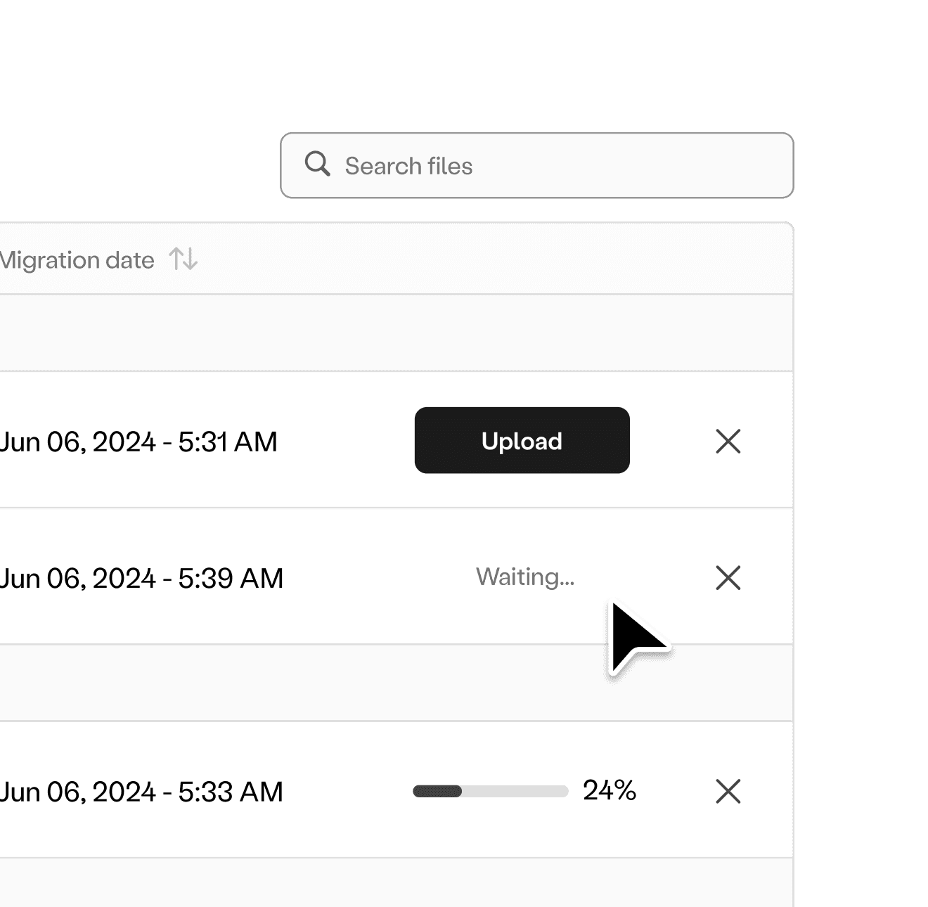
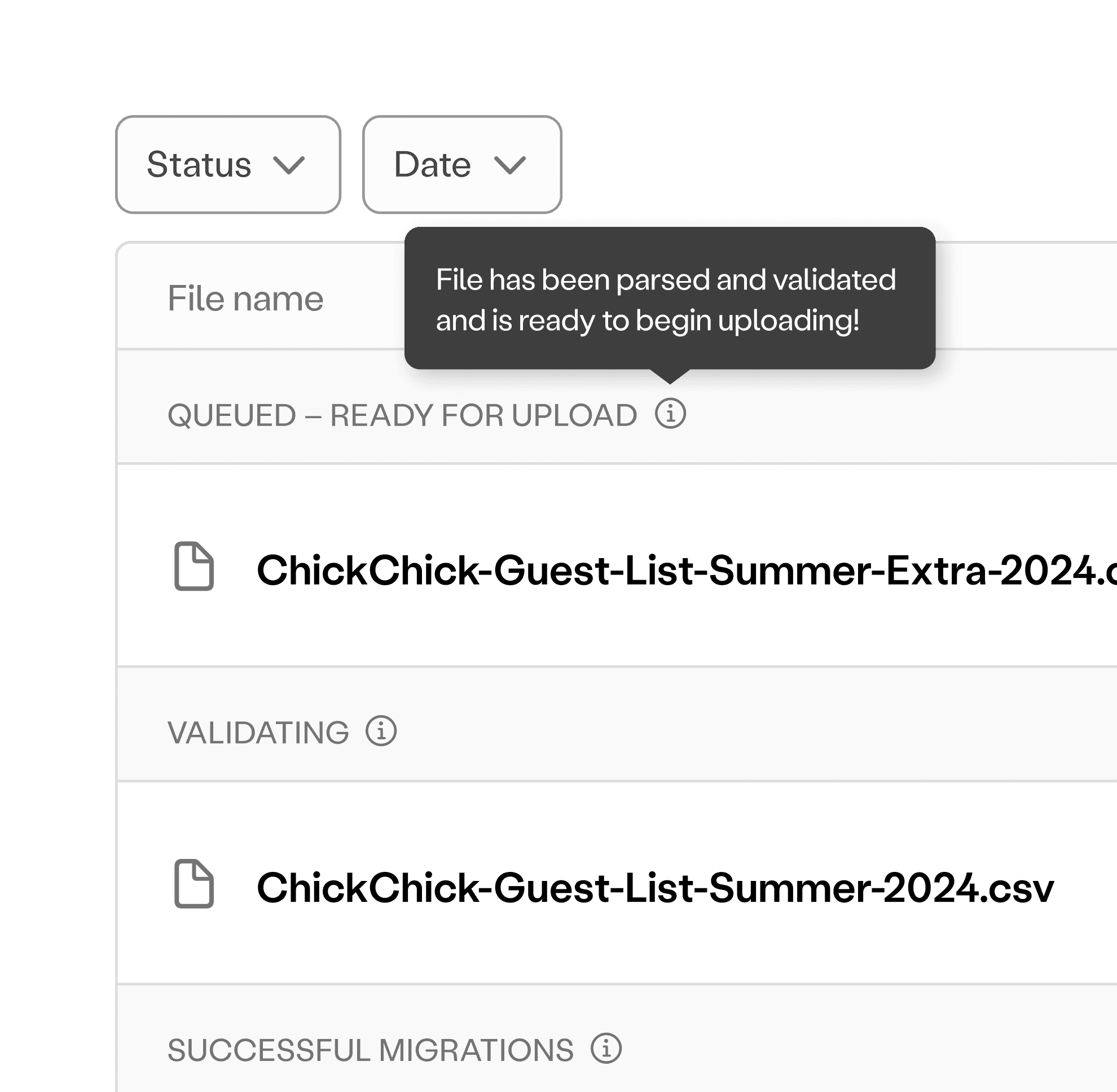
Solution: The layout should highlight essential elements while reducing clutter. We added the file name and file icon to each respective upload, new headers to identify what status a file was in (with a tool-tip for further details) and a file search and sort via status/date functions.
Users really liked these changes as this helped them reduce scrolling and speed up the search in the case that there were multiple file uploads over time, and – instead of just a long list of uploads, the new design improved the hierarchy to give a clearer overview of all file upload statuses at a glance.
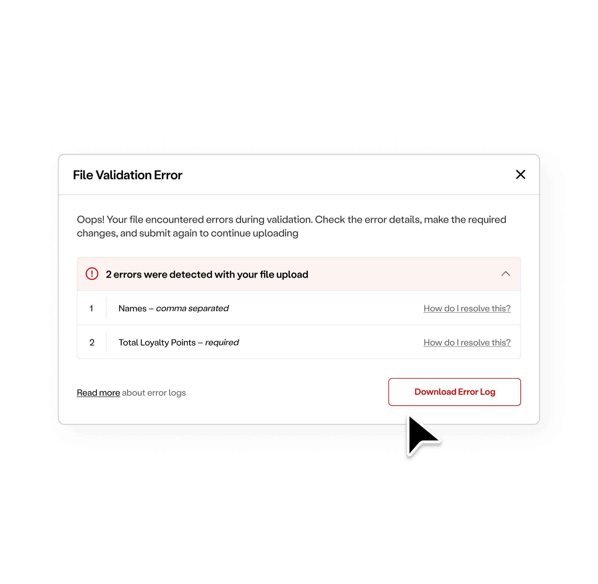
Solution: The upload system should provide guidance and actionable steps to help users diagnose errors.
In the instance that a file has errors preventing its upload, we provide an overview of the general formatting errors, how to fix them, and the ability to download the error log for a closer look on what went wrong.
After a few rounds of usability testing and revisions, we arrived at the final approved direction. The new design delivered on the goal to provide users with an improved guest migration process and enjoyable dashboard experience, and to provide them with the tools they needed to fix errors quickly.
Tracking the success metrics we set early on in the process, we were excited to see that post-launch, we had achieved an adoption rate of 100% by the Onboarding team! Other key wins included:
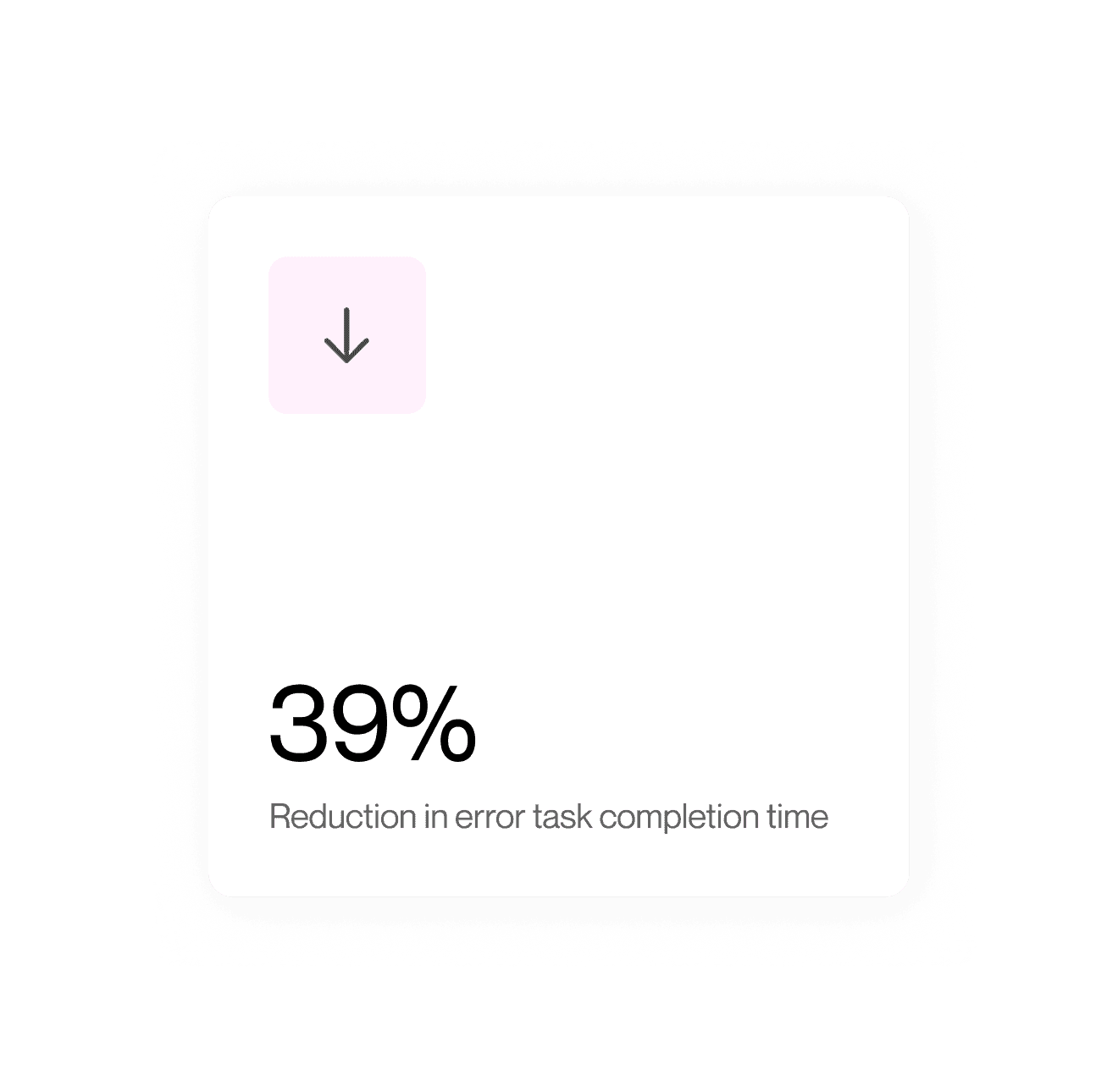
39% reduction in error task completion time – With the new file validation flow designed to catch errors early in the upload process and guide them through error resolution, users spent less time overall troubleshooting files!
Increased customer ratings – Customer surveys reported strong gains in ease of use, visual effectiveness, trust, hierarchy, and feelings of innovation in a cross analysis scoring of the old design vs. the new design
Team members felt more empowered – Through the new CSV template button and the error log help, the team was able to take troubleshooting matters into their own hands