Locations Redesign
Locations Redesign
Locations Redesign
Locations Redesign
Background
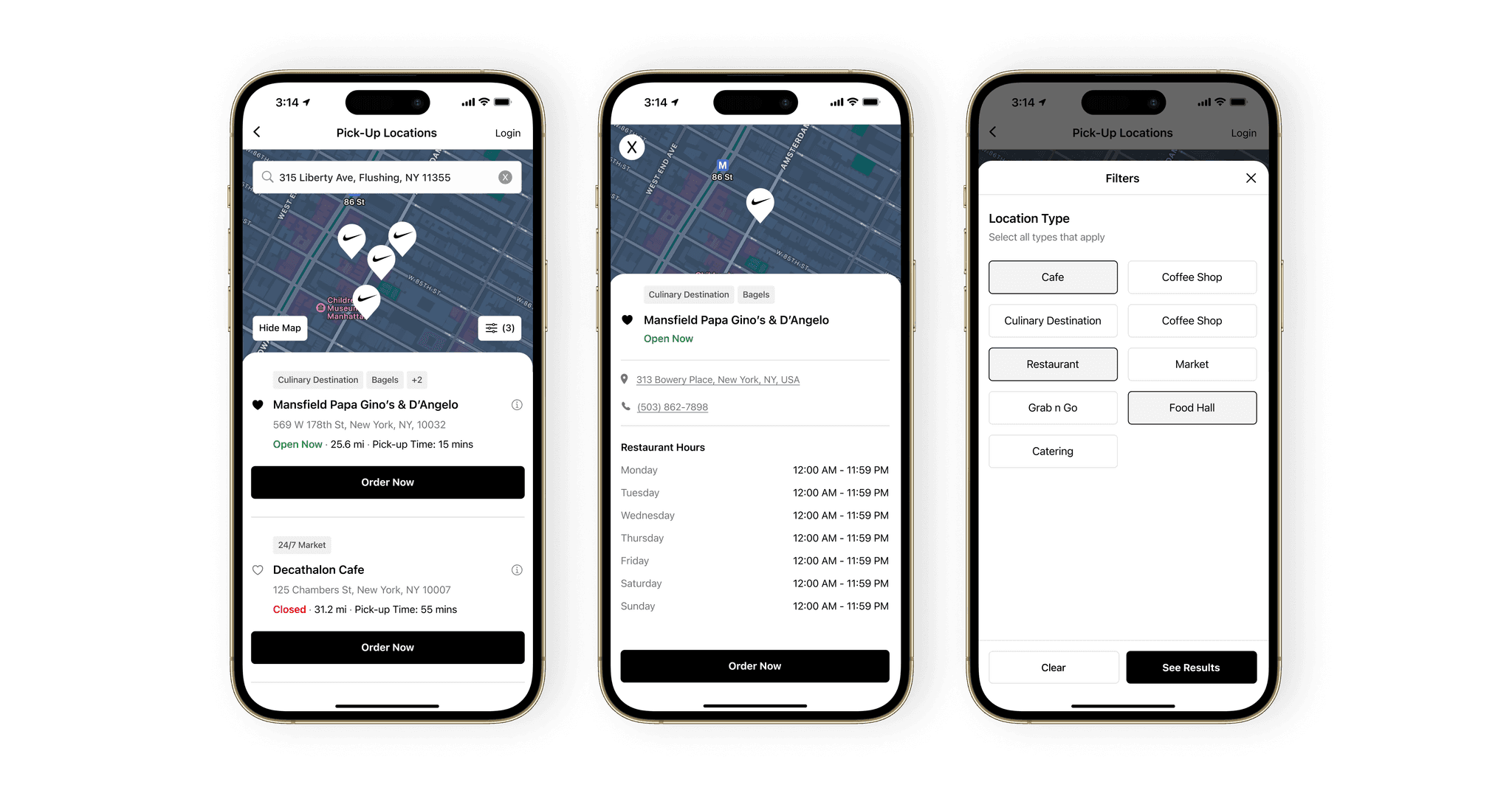
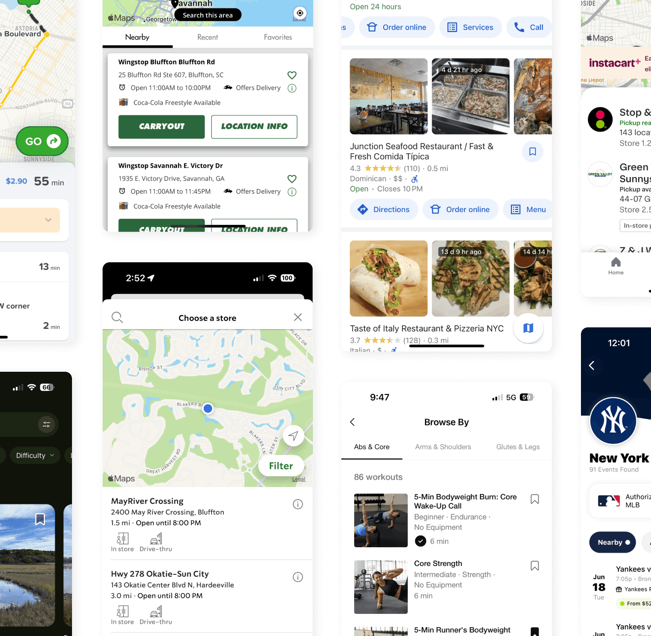
In the Lunchbox Native ecosystem, the location screen is a crucial step in the customer journey of placing an order for delivery or pick-up. From this step, users are able to see a list of stores to order from, including: store name, address, open/closed status, store hours, estimated pick-up time, distance to the store, favorited locations, and store contact information
About
A common customer and client complaint was the muddled locations screen on app. As lead product designer on the project, I set out to understand and address interface and usability issues in the experience and overhaul the outdated, legacy screens
Time frame
Mar 2024
Personnel
Matthew Bookhout
Product Manager
Engineering Team
Onboarding Team
Locations Redesign
Background
In the Lunchbox Native ecosystem, the location screen is a crucial step in the customer journey of placing an order for delivery or pick-up. From this step, users are able to see a list of stores to order from, including: store name, address, open/closed status, store hours, estimated pick-up time, distance to the store, favorited locations, and store contact information
About
A common customer and client complaint was the muddled locations screen on app. As lead product designer on the project, I set out to understand and address interface and usability issues in the experience and overhaul the outdated, legacy screens
Personnel
Matthew Bookhout
Product Manager
Engineering Team
Onboarding Team
Time Frame
Mar 2024
Context
I led a cross-functional team effort to rapidly execute the location screen redesign. From here, we identified an already scoped feature request from our backlog that we could tackle along with this: the ability to filter by location type when searching locations. A win-win!
Problem
Both customers and clients were raising the issue that the screen was cluttered, it lacked clear actionable buttons, and for clients – it required too much back and forth with the Lunchbox CX team to get the layout right. Time spent tweaking = pushing the go-live date back and no sales.
Goal
To address and solve for concerns around lack of cohesion and layout, drive easier ordering to get the customer to the menu faster, and provide a pleasant and modern design that felt in step with the Lunchbox ethos of innovation.
Discovery and Research
Discovery and Research
Discovery and Research
Discovery and Research
Discovery and Research
We hypothesized that we likely didn’t need to change the flow but mainly focus on the information architecture and layout. That way we could get this live quickly, and solve these problems with minimum effort and maximum impact.
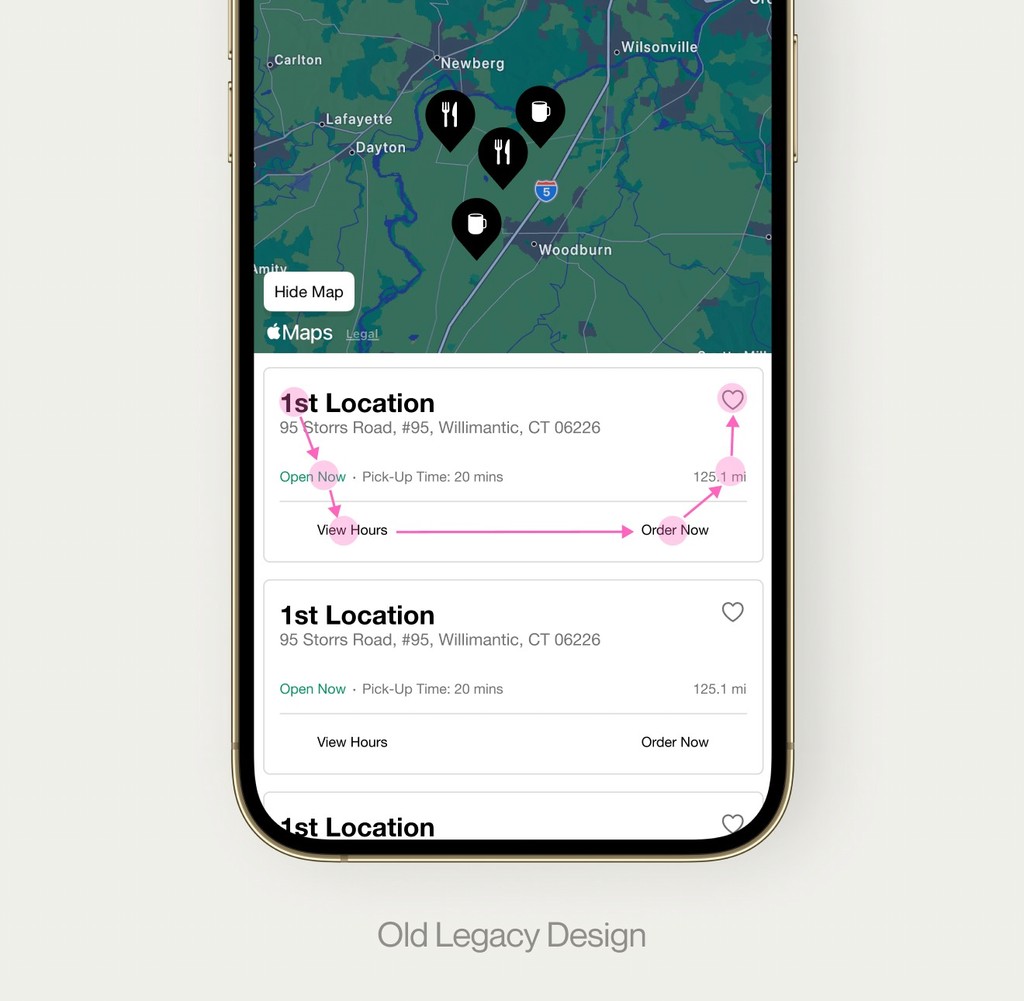
We kicked things off with a quick Fullstory session and we uncovered that only 3% of users clicked on the ‘view hours’ button. We wondered why this was the case. Early questions in our internal debrief included:
Is the ‘view hours’ option useful?
Should ‘view hours’ be given the same emphasis as ‘order now’?
Can we drive quicker decision making by improving contrast and using buttons rather than text for CTAs?
What information is absolutely needed and necessary here?
How can we improve grouping, spacing, and hierarchy to make these cards more effective?
We hypothesized that we likely didn’t need to change the flow but mainly focus on the information architecture and layout. That way we could get this live quickly, and solve these problems with minimum effort and maximum impact.
We kicked things off with a quick Fullstory session and we uncovered that only 3% of users clicked on the ‘view hours’ button. We wondered why this was the case. Early questions in our internal debrief included:
Is the ‘view hours’ option useful?
Should ‘view hours’ be given the same emphasis as ‘order now’?
Can we drive quicker decision making by improving contrast and using buttons rather than text for CTAs?
What information is absolutely needed and necessary here?
How can we improve grouping, spacing, and hierarchy to make these cards more effective?
Hey, I'm MB
An early prototype shared with the team
An early prototype shared with the team
An early prototype shared with the team
An early prototype shared with the team
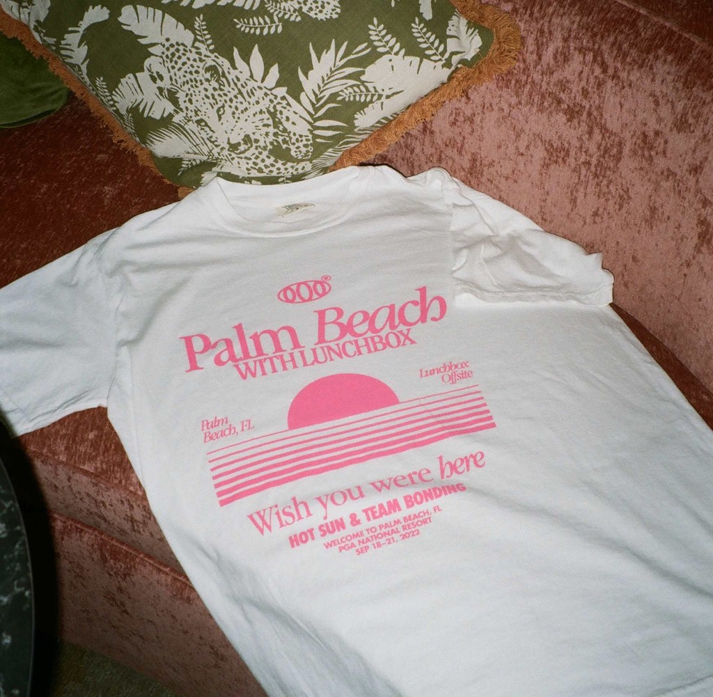
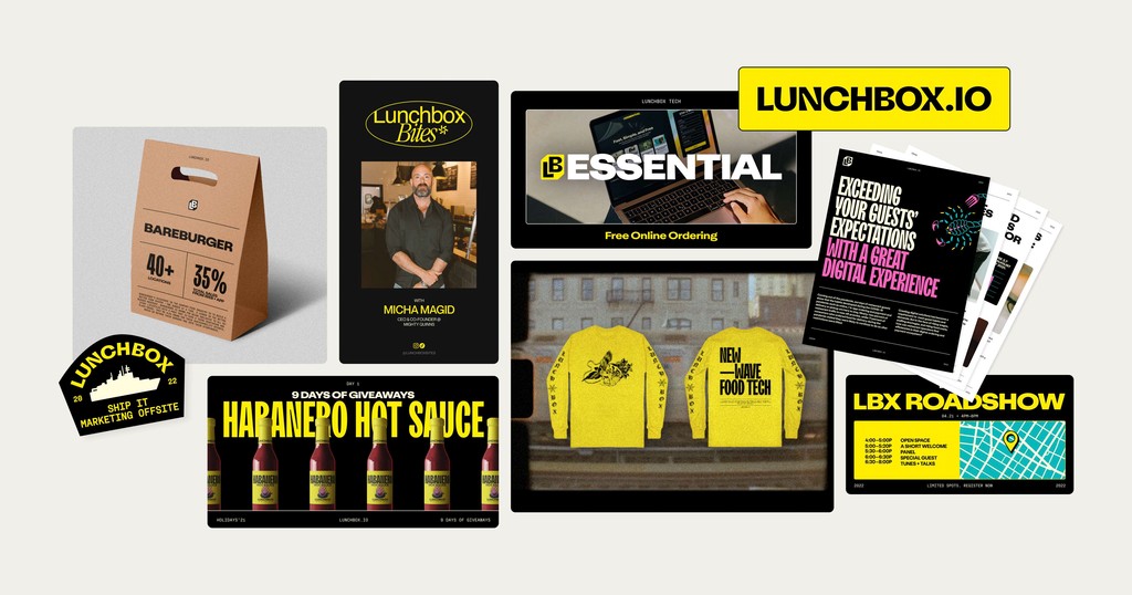
As Lead Brand Designer, I was tasked with maintaining the visual system as well as pushing the brand beyond its current design language through limited-run merch, digital/physical campaigns, and outside the box designs. The design team quickly became recognized for our consistently strong visual output and punching far above our weight, while pushing out memorable marketing initiatives in a stale and predictable industry
As Lead Brand Designer, I was tasked with maintaining the visual system as well as pushing the brand beyond its current design language through limited-run merch, digital/physical campaigns, and outside the box designs. The design team quickly became recognized for our consistently strong visual output and punching far above our weight, while pushing out memorable marketing initiatives in a stale and predictable industry
Before
"Just solving for this [x thing] would save me hours and hours per week… people wouldn't have to rely on me for migrations!"
"Just solving for this [x thing] would save me hours and hours per week… people wouldn't have to rely on me for migrations!"
"Just solving for this [x thing] would save me hours and hours per week… people wouldn't have to rely on me for migrations!"
"Just solving for this [x thing] would save me hours and hours per week… people wouldn't have to rely on me for migrations!"
Before
After
Context
I led a cross-functional team effort to rapidly execute the location screen redesign. From here, we identified an already scoped feature request from our backlog that we could tackle along with this: the ability to filter by location type when searching locations. A win-win!
Problem
Both customers and clients were raising the issue that the screen was cluttered, it lacked clear actionable buttons, and for clients – it required too much back and forth with the Lunchbox CX team to get the layout right. Time spent tweaking = pushing the go-live date back and no sales.
Goal
To address and solve for concerns around lack of cohesion and layout, drive easier ordering to get the customer to the menu faster, and provide a pleasant and modern design that felt in step with the Lunchbox ethos of innovation.
Competitive Analysis
Competitive Analysis
Competitive Analysis
Competitive Analysis
Competitive Analysis
I compiled a research board of over 20 consumer screens with a healthy dose of restaurant app references, as well as apps in the food & drink, navigation, health & fitness, and entertainment categories.
Key takeaways were not only just how locations were presented, but also how text, color, and spacing was used to deliver an interface that users want to hold in their hands!
Competitive Analysis
Business Challenges
Business Challenges
Business Challenges
Business Challenges
Business Challenges
Engineering Constraints
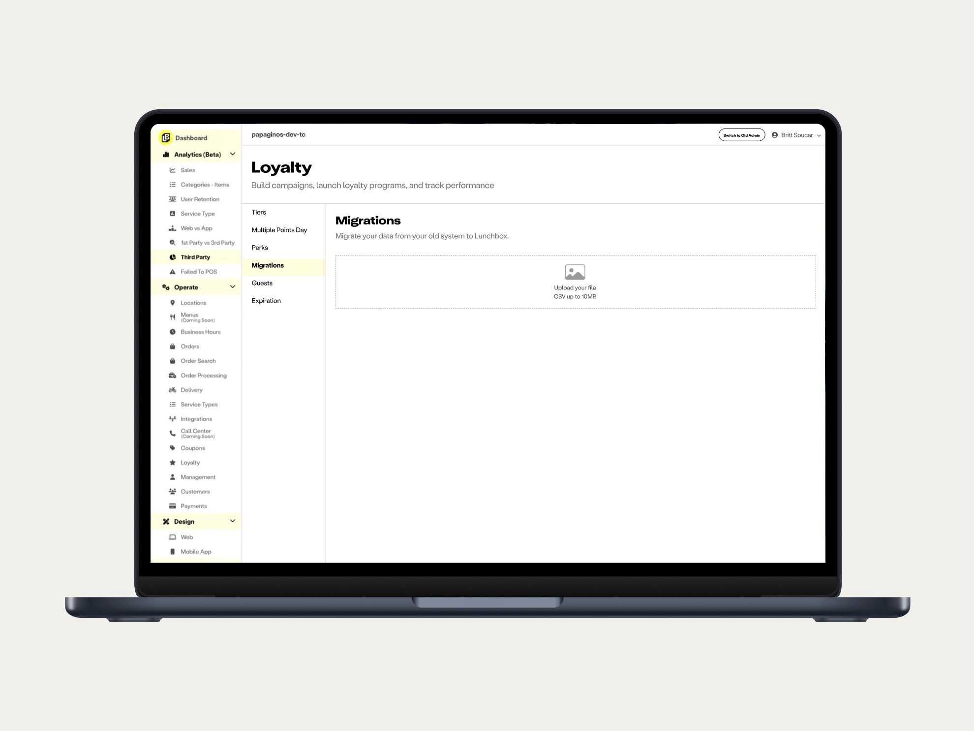
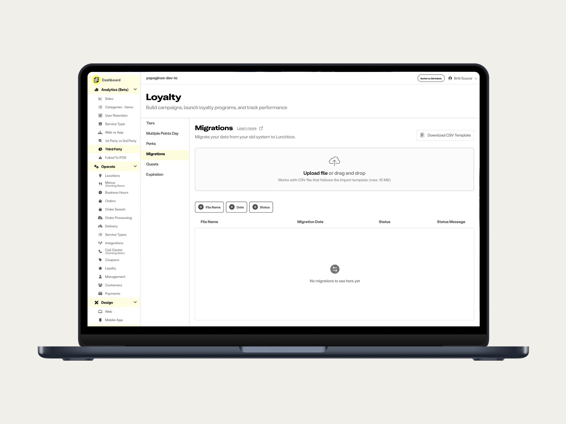
The backend wouldn't allow for multiple file uploads to occur simultaneously; it was too taxing and costly! We would have to find a solution that would seamlessly allow for one file upload at a time, without adding too many steps or bogging the user down
The backend wouldn't allow for multiple file uploads to occur simultaneously; it was too taxing and costly! We would have to find a solution that would seamlessly allow for one file upload at a time, without adding too many steps or bogging the user down
The backend wouldn't allow for multiple file uploads to occur simultaneously; it was too taxing and costly! We would have to find a solution that would seamlessly allow for one file upload at a time, without adding too many steps or bogging the user down